 Mobile simulator - responsive testing tool


Overview
Mobile simulator - responsive testing tool is a Chrome extension developed by François Duprat.
According to the data from Chrome web store, current version of Mobile simulator - responsive testing tool is 3.8.2, updated on 2022-10-10.
300,000+ users have installed this extension.
802 users have rated this extension with an average rating of .
developer website: webmobilefirst.com
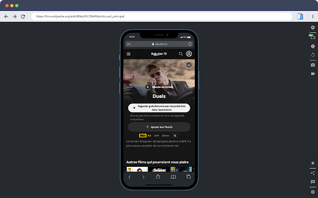
Smartphone and tablet simulator on computer with several models to test mobile responsive websites.
Smartphones and tablets simulator on computer very realistic with several models and resolutions to test your mobile site.
📱16 models of Android smartphones :
- Samsung Galaxy S20 (CSS resolution 360px)
- Huawei P30 PRO (CSS resolution 360px)
- Google Pixel 5 (CSS resolution 393px)
- Oneplus Nord 2 (CSS resolution 412px)
- Samsung Galaxy Z Flip3 (CSS resolution 360px)
- OPPO Find X3 PRO (CSS resolution 360px)
- Samsung Galaxy A12 (CSS resolution 360px)
- Samsung Galaxy S21 Ultra (CSS resolution 360px)
- Google Pixel 6 PRO (CSS resolution 360px)
- Xiaomi 12 (CSS resolution 360px)
- Samsung Galaxy Note20 Ultra (CSS resolution 412px)
- Samsung Galaxy S22 (CSS resolution 360px)
- Samsung Galaxy S22+ (CSS resolution 360px)
- Samsung Galaxy S22 ULTRA (CSS resolution 360px)
📱19 models of Apple smartphones :
- iPhone 5 (CSS resolution 320px)
- iPhone SE (CSS resolution 320px)
- iPhone X (CSS resolution 375px)
- iPhone XR 2018 (CSS resolution 414px)
- iPhone 11 (CSS resolution 414px)
- iPhone 11 PRO (CSS resolution 375px)
- iPhone 11 PRO MAX (CSS resolution 414px)
- iPhone 12 Mini (CSS resolution 360px)
- iPhone 12 (CSS resolution 390px)
- iPhone 12 PRO (CSS resolution 390px)
- iPhone 12 PRO MAX (CSS resolution 428px)
- iPhone 13 Mini (CSS resolution 375px)
- iPhone 13 (CSS resolution 390px)
- iPhone 13 PRO (CSS resolution 390px)
- iPhone 13 PRO MAX (CSS resolution 428px)
- iPhone 14 (CSS resolution 390px)
- iPhone 14 MAX (CSS resolution 428px)
- iPhone 14 PRO (CSS resolution 390px)
- iPhone 14 PRO MAX (CSS resolution 428px)
💻 5 models of tablets :
- Samsung Galaxy Tab S7 (CSS resolution 1280px landscape mode)
- iPad Air 4 (CSS resolution 1180px landscape mode)
- iPad Air Mini (CSS resolution 1024px landscape mode)
- iPad PRO 11" (CSS resolution 1194px landscape mode)
- Microsoft Surface Duo (CSS resolution 1114px landscape mode)
⌚️ 8 special devices :
- Apple Watch Serie 6 (CSS resolution 162px)
- Samsung Galaxy Fold 2 (CSS resolution 884px)
- Apple Macbook Air (CSS resolution 1280px)
- Dell Latitude (CSS resolution 1440px)
- Apple Macbook PRO 16" (2021) (CSS resolution 1728px)
- Samsung Smart TV NEO 4K (CSS resolution 1920px)
- Self service kiosk (CSS resolution 1080px)
- Zebra MC330 (CSS resolution 480px)
Key features
🎬 Create screencasts in GIF format very easily.
📸 It is also possible to take a screenshot of the smartphone in transparent PNG to insert it in an email, presentation slides, etc.
🌚 Night mode available (see screenshots)
🏷 A non intrusive advertisement is displayed in the free version
Mobile simulator - responsive testing tool Alternatives


Latest Reviews
See More
 Jeremy Valentin
2022-05-12
good |
 alejandraceno
2022-05-11
estoy encantada... ADORACIÓN!!! |
 Zaidal Bustomi
2022-05-11
Keren |
|
Ramond Falcão
2022-05-09
Melhor que vi até agora para resolução de telas! |
 Renata Navarro
2022-05-09
Really good extension. Helps a lot. |