 Viewport Resizer – Responsive Testing Tool


Overview
Viewport Resizer – Responsive Testing Tool is a Chrome extension developed by Malte Wassermann.
According to the data from Chrome web store, current version of Viewport Resizer – Responsive Testing Tool is 1.1.9, updated on 2019-12-28.
80,000+ users have installed this extension.
259 users have rated this extension with an average rating of .
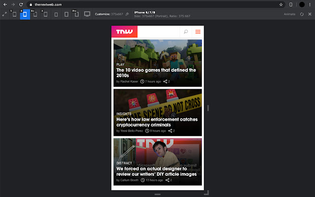
Responsive design testing tool to test any website’s responsiveness – it only takes 2 seconds! Emulate various screen resolutions.
Viewport Resizer is a tool to test any website’s responsiveness. Just install the extension, go to the page you want to test and check all kinds of screen resolutions of the page.
The smartest way to share your defined environment of devices and breakpoints directly with your team and client.
This tool should not replace a real device simulation. It rather helps you, your team and client testing statuses, transitions, text length etc. throughout different device types.
Viewport Resizer – Responsive Testing Tool Alternatives


Latest Reviews
See More
 Diego Matias
2022-03-17
La califico con 1 estrella porque no sirve para trabajos en Local. Era para lo que lo necesitaba, una lástima. Aún así funciona perfecto en webs que están en servidores. |
 Alice G
2022-02-03
Too bad it doesn't work for local files. I wanted to use it as a dev tool... |
 Varun 'Scarfoot' C
2022-01-26
SO USEFUL! Thank you so much! |
 Danny Ben Shitrit
2021-12-13
Excellent extension. Does not require any privileges, resizes just the viewport and works for resolutions larger than your own screen. The animate feature is great for seeing all sizes one by one without lifting a finger. Recommended for developers. |
 Star Xu
2021-11-18
关闭按钮不能用啊 |